Project Overview
Katch is a US-based early-stage startup with less than 20 employees. At the time I joined the company as the sole designer on the team, the product was in the private beta stage.
During my limited time at Katch, I achieved the following goals:
Designed a Slack prototype as at the time we deemed it to be the ideal medium to conduct user research and observe user behaviors.
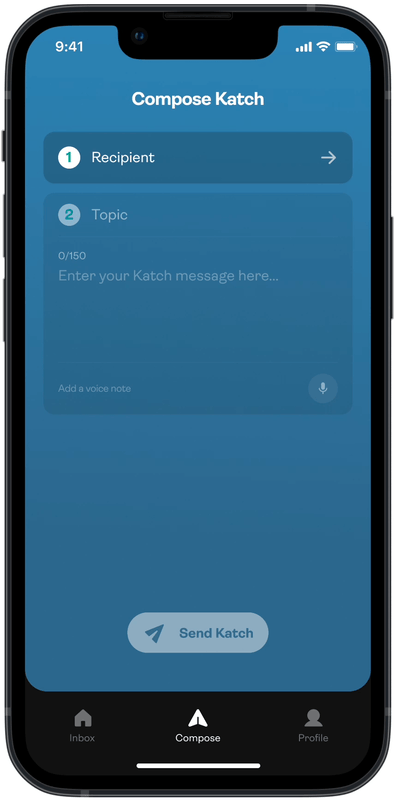
Re-designed several primary features for the Katch iOS app and conducted discussion sessions with the Head of Product and the dev team.
Testimonial
“Goksu demonstrated strong analytical skills and could easily grasp the whole user journey from the first day of his work, which really impressed me. Thanks to his user empathy skills he helped us redesign the navigation of the app and worked on a slack app which is still to be implemented. Goksu can challenge ideas that make him a great team member.”